New Fretebras Platform
This case focuses on the second cycle of usability testing, where I validated critical visual and functional concepts for the user journey.
YEAR
2021
COMPANY
Fretebras
ROLE
Prototyping
Usability tests
Data analysis
Beta testing
01.
Overview
Fretebras is the largest platform connecting independent truck drivers and carriers in Brazil. The Carrier Portal is the vital tool where carriers manage their freight postings and hiring.
The project involved the complete reconstruction of the platform using cutting-edge technology to support the ecosystem's growth. This case focuses on the second cycle of usability testing, where I validated critical visual and functional concepts for the user journey.
02.
The Challenge
The previous platform was technologically outdated and did not support essential new features for the business model. The challenge was to create an interface that was intuitive for a diverse audience (from small to large carriers) and that optimized freight closing time.
Test Objectives (Round 2):
- Validate the clarity and comprehension of new visual and functional concepts.
- Evaluate the ease of use and fluidity of the proposed flows.
- Identify friction points and opportunities for improvement in the user experience.
03.
Usability Test Methodology
For this round of testing, we adopted a qualitative and exploratory approach, focusing on user interaction with high-fidelity prototypes of the new Carrier Portal.
Test Structure:
- Sample: We conducted moderated tests with a representative sample of Fretebras' carrier clients, covering different profiles and company sizes.
- Format: Individual and remote sessions, where participants interacted with the prototype while being observed and questioned about their actions and perceptions.
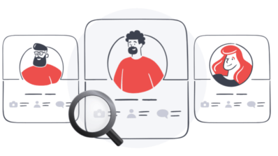
- Tasks: Users were invited to perform key tasks within the platform, simulating real-world usage scenarios, such as freight registration, posting management, and driver search.
- Data Collection: We recorded observations on user behavior, difficulties encountered, spontaneous comments, and qualitative feedback on the overall experience.
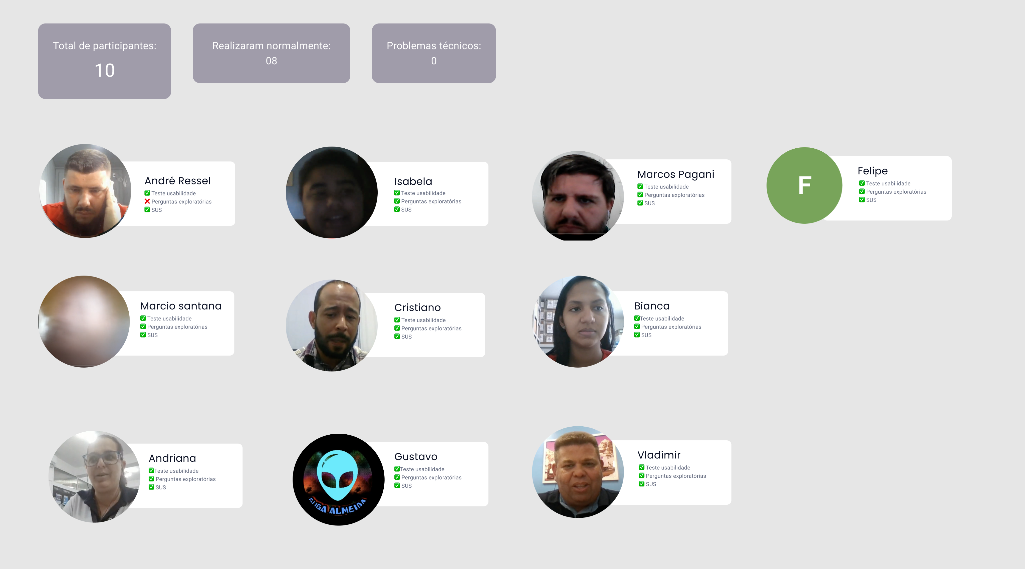
(Participants who took part in the usability test)
04.
Learnings and Insights
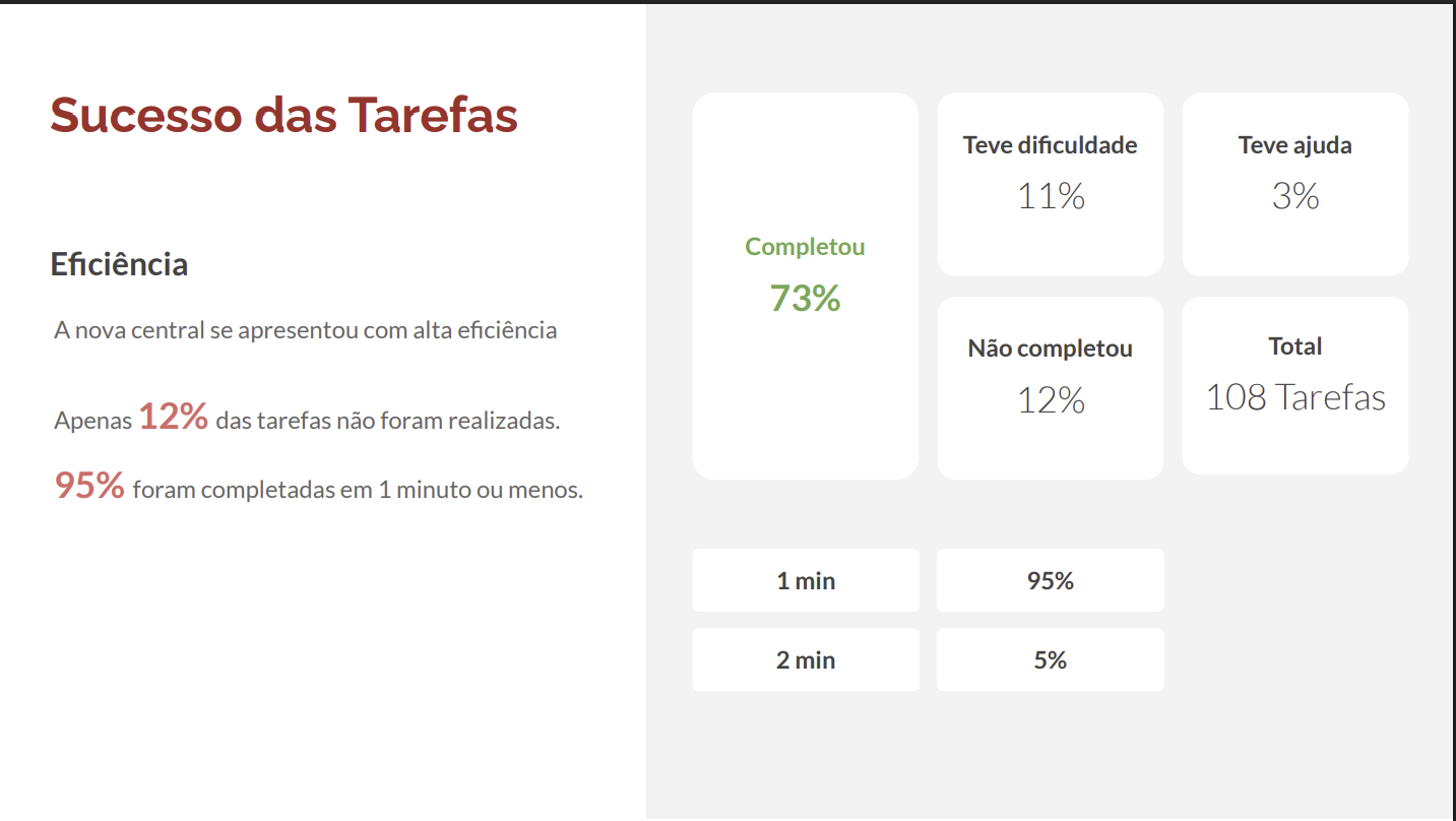
The test revealed valuable insights into the new proposal, allowing us to refine the design before development.
Usability tests:

10
Usability tests

5
Small companies


5
Mid/Big companies
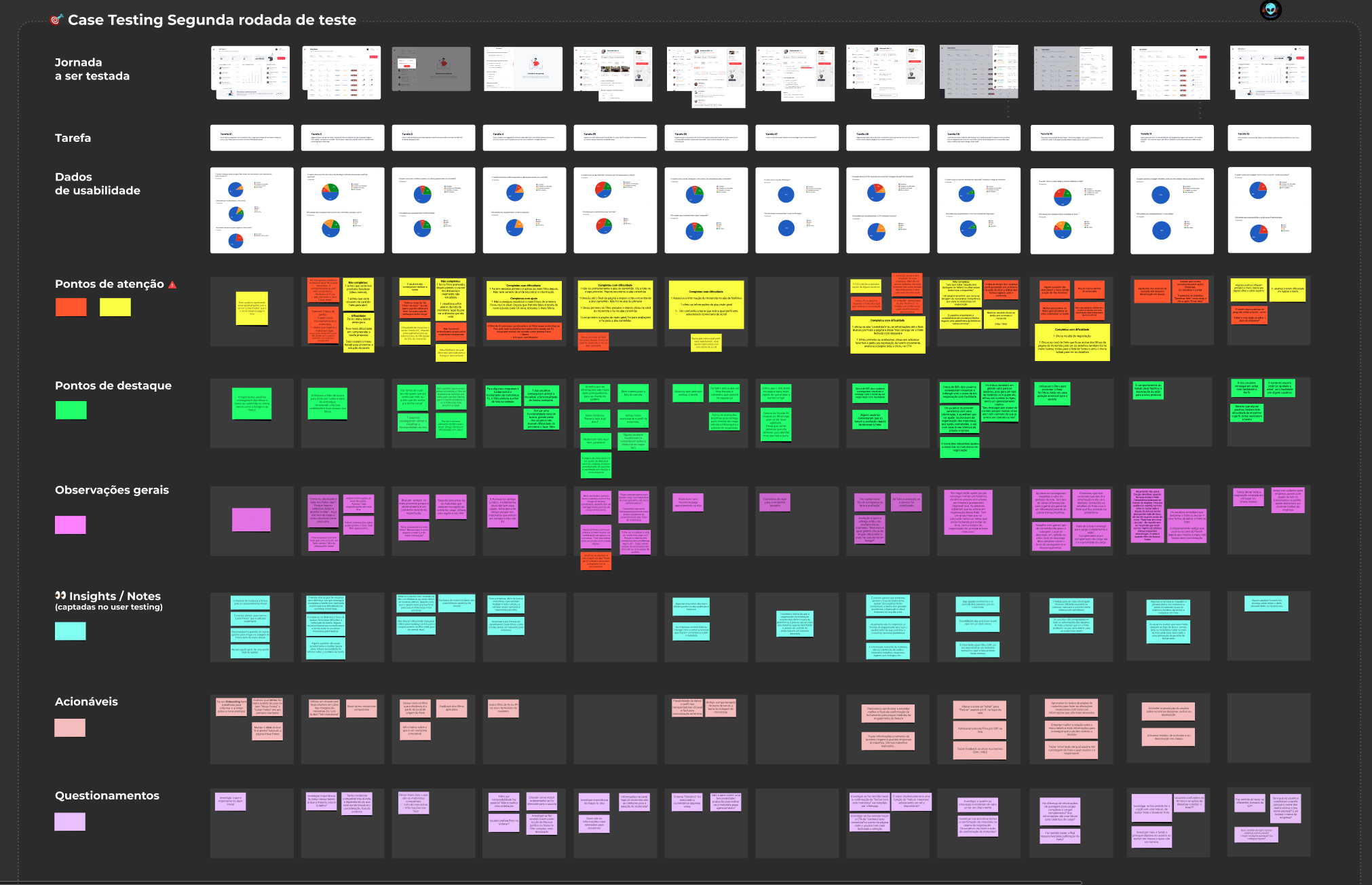
(Board canvas with charts, insights and problems by tasks)
Confirmed Strengths:
- The clarity of the new layout and the information organization were widely praised, indicating that the visual direction aligned with user expectations.
- The fluidity of flows for essential tasks was well-received, suggesting that the journey optimization was on the right track.
Opportunities for Improvement:
- We identified that the placement of some calls to action (CTAs) in critical flows could be more intuitive, leading to moments of hesitation for users.
- We observed the need for adjustments in certain nomenclatures to ensure immediate and universal understanding by all user profiles.
05.
- Iterations and Next Steps
Based on the qualitative insights from the test, the following actions were taken to improve the prototype:
- Interface Optimization: We made adjustments to the positioning and prominence of key interactive elements to guide the user more effectively.
- Flow Refinement: We reviewed task steps that presented the most friction, seeking to simplify and make navigation more direct.
- Content Improvement: We proposed changes to texts and labels to ensure clarity and reduce cognitive load.
- Exploration of New Features: Feedback also directed the exploration of complementary functionalities that could enrich the experience, such as advanced filters or integrations with communication tools.
06.
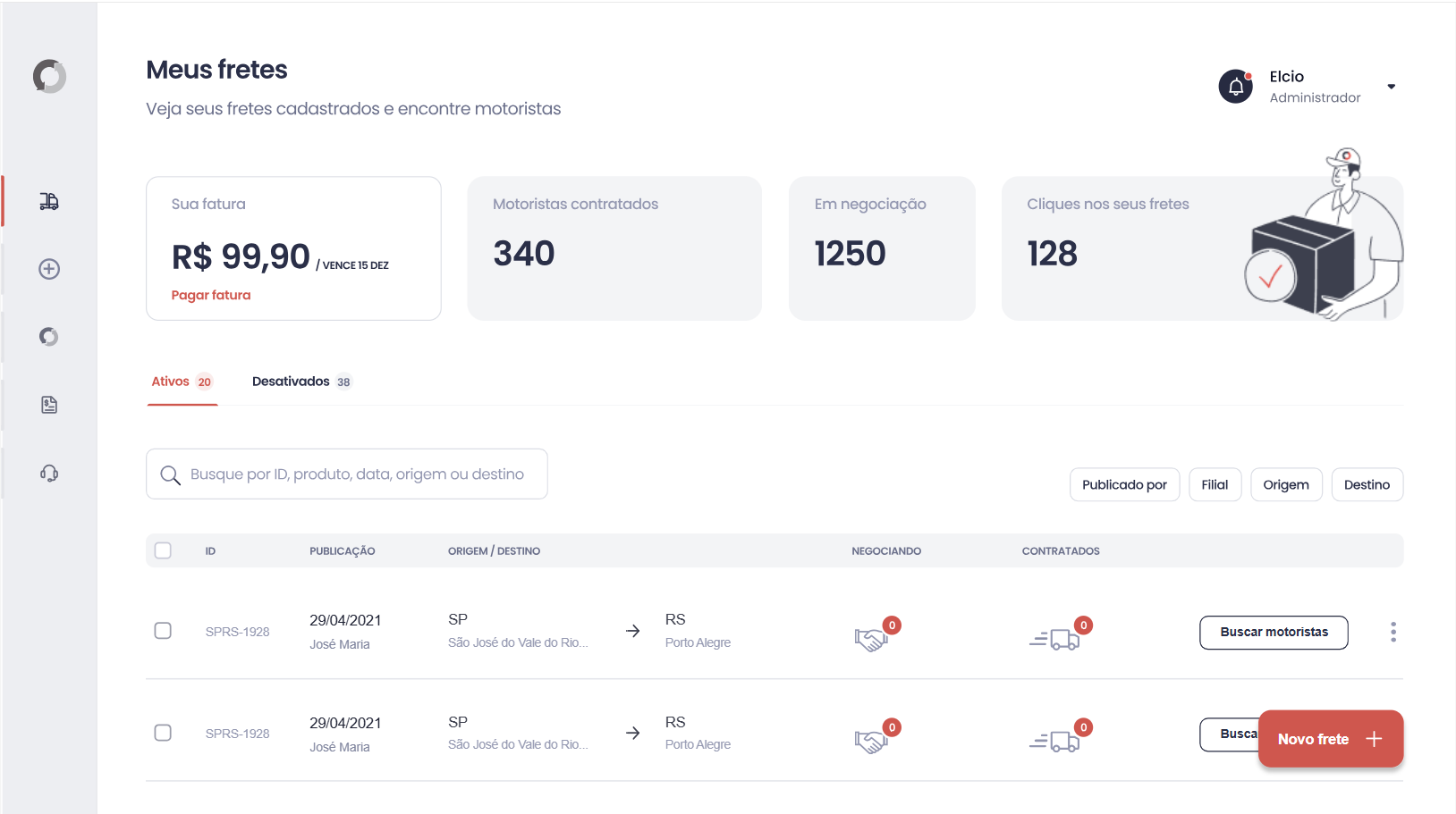
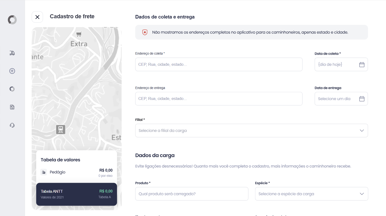
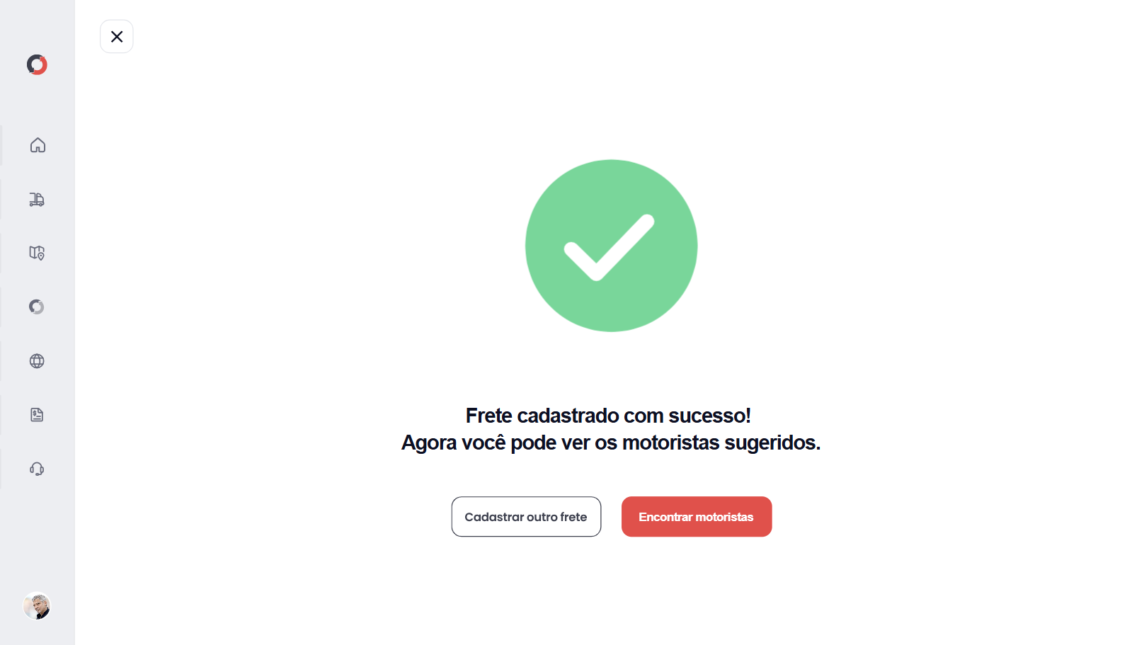
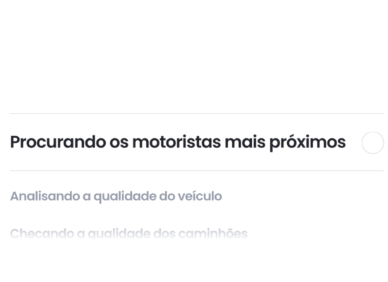
Prototype
The prototype was made on www.protopie.ioHere are some screens and animations used on prototype.