


Redesign Ok Roger
Simplifying Corporate Travel Management
YEAR
2025
COMPANY
Ok Roger
ROLE
Information Architecture
User Flows
UI Design
Style Guide
01.
Overview
OK Roger is a B2B platform focused on simplifying travel management for organizations. The core objective is to allow administrators to set up policies, manage approvals, and track expenses efficiently ("set-it-and-forget-it").
This project was a conceptual redesign exercise aimed at demonstrating Information Architecture, UX, and UI skills, transforming a complex interface into an intuitive and visually appealing experience.
02.
The Challenge
The original version of the platform had not undergone a professional design process. New features were added over time without a holistic vision, resulting in:
The Problem
- Confusing Information Architecture: Difficulty understanding how to manage members and policies.
- Dated Interface: Lack of visual clarity and hierarchy.
- Complex Flows: Unintuitive approval processes and rule configurations.
Exercise Goals:
- Restructure the Information Architecture.
- Design a Dashboard that conveys control and clarity.
- Create a modern and "beautiful" interface.
Original UI
03.
Design Process
Unlike projects with field research, the focus here was on UX sensibility and UI craft.
Steps:
- Original Platform Analysis: Identification of bottlenecks in Dashboard, Policies, and User Management flows.
- Information Architecture: Reorganization of page hierarchy to facilitate navigation.
- User Flows: Optimization of core tasks (Adding Approvers, Creating Rules, Registering Users).
- Design System: Creation of a modern style guide (Gilroy as the primary typeface, technological color palette).
04.
Solutions and Improvements
We designed the new workstation focusing on performance, clarity, and predictability.
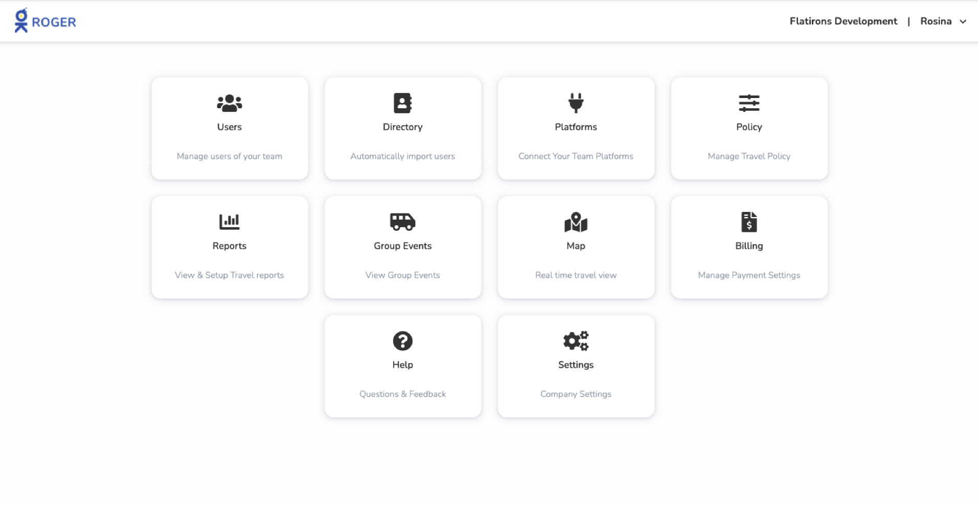
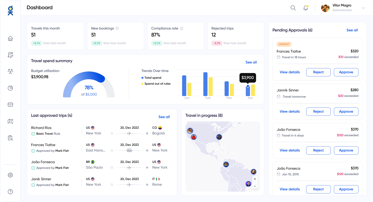
Main Dashboard
- KPI Visualization: Introduction of charts for quick absorption of spending information and trends.
- Action-Oriented: Immediate highlight for trips pending approval, reducing administrator response time.
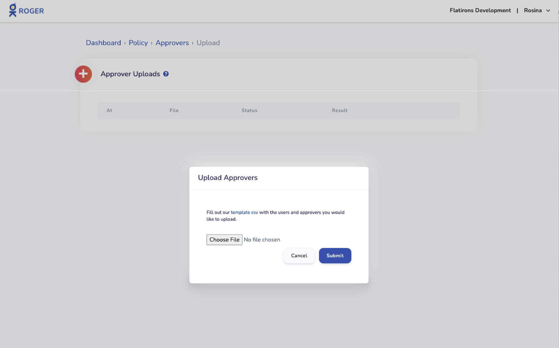
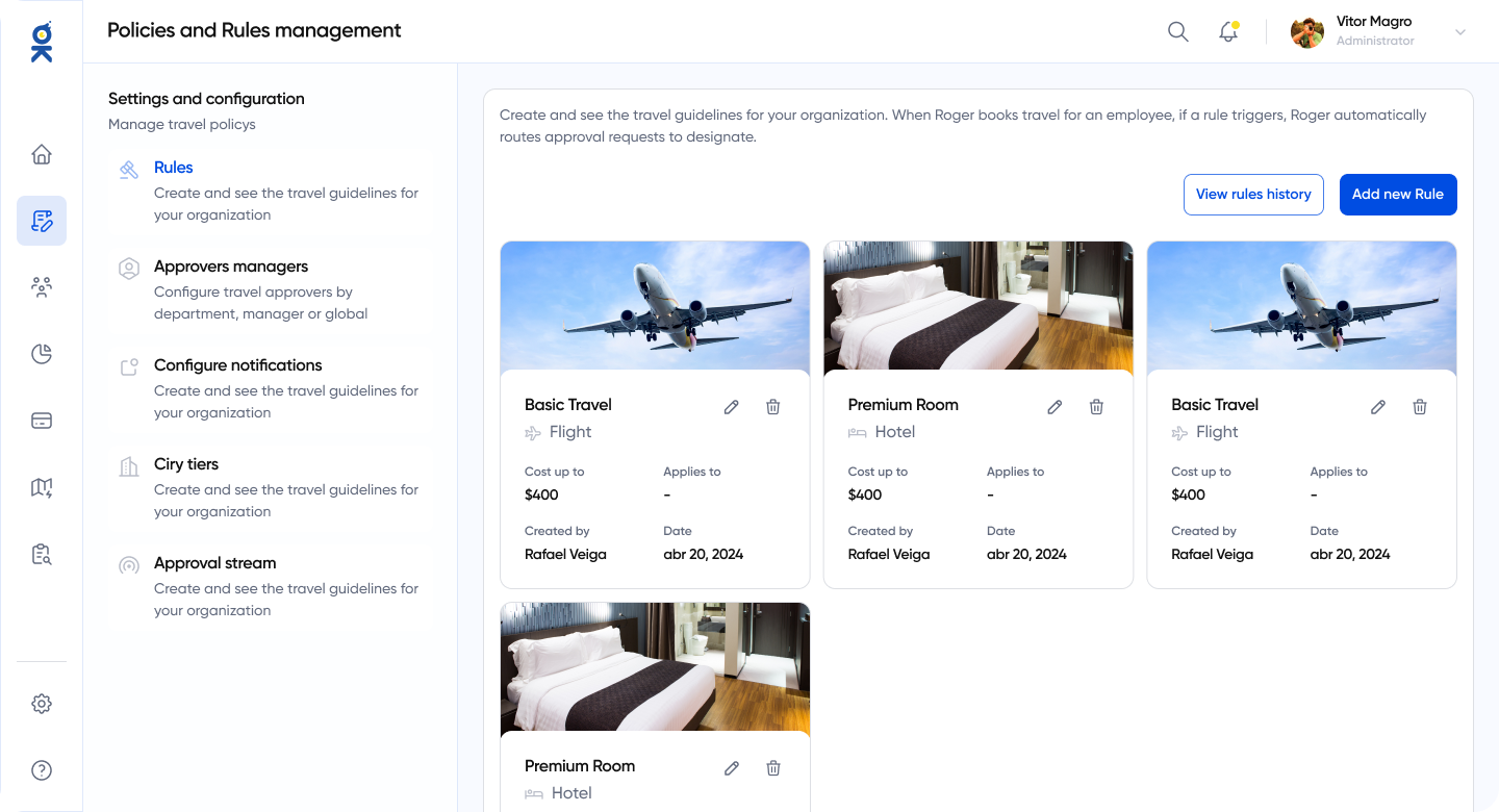
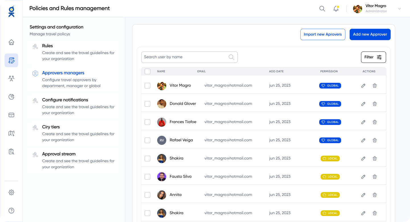
Policy and Approver Management
- Rule Visualization: Enhanced interface for reading complex rules (e.g., spending limits by category).
- Rule History: Suggestion to include history for greater control and auditing.
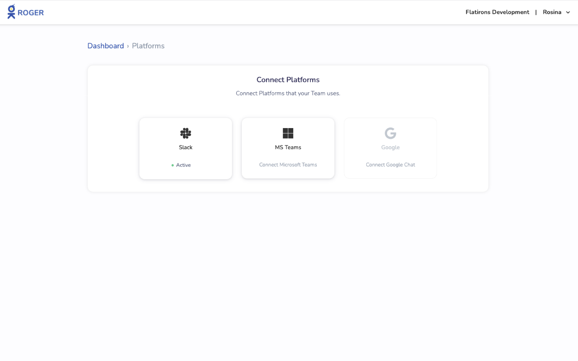
- Approver Tags: Implementation of "Global" or "Local" tags to differentiate the scope of each approver.
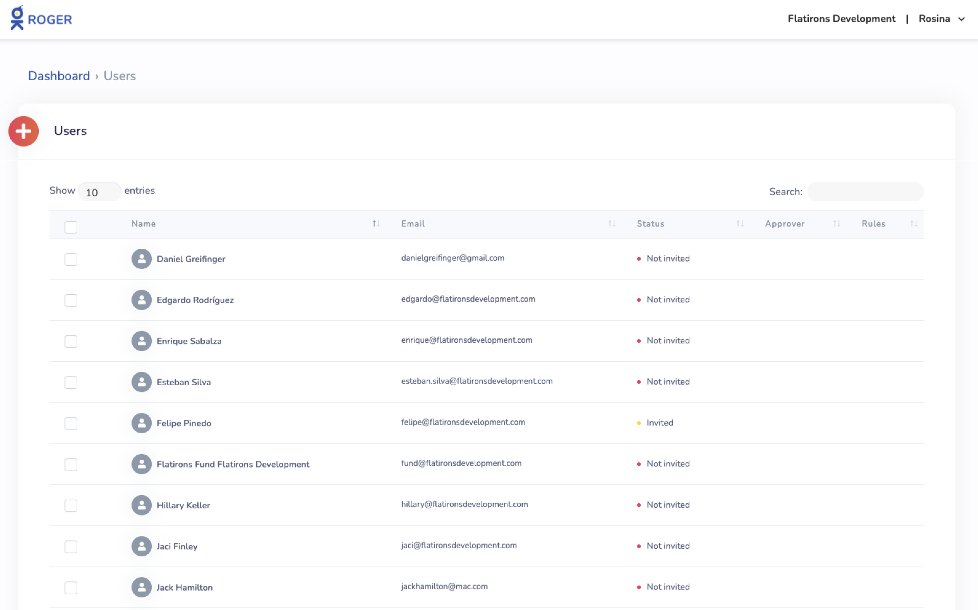
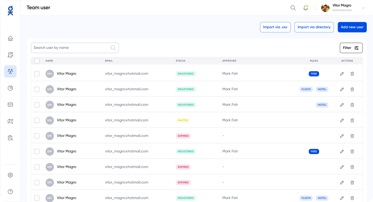
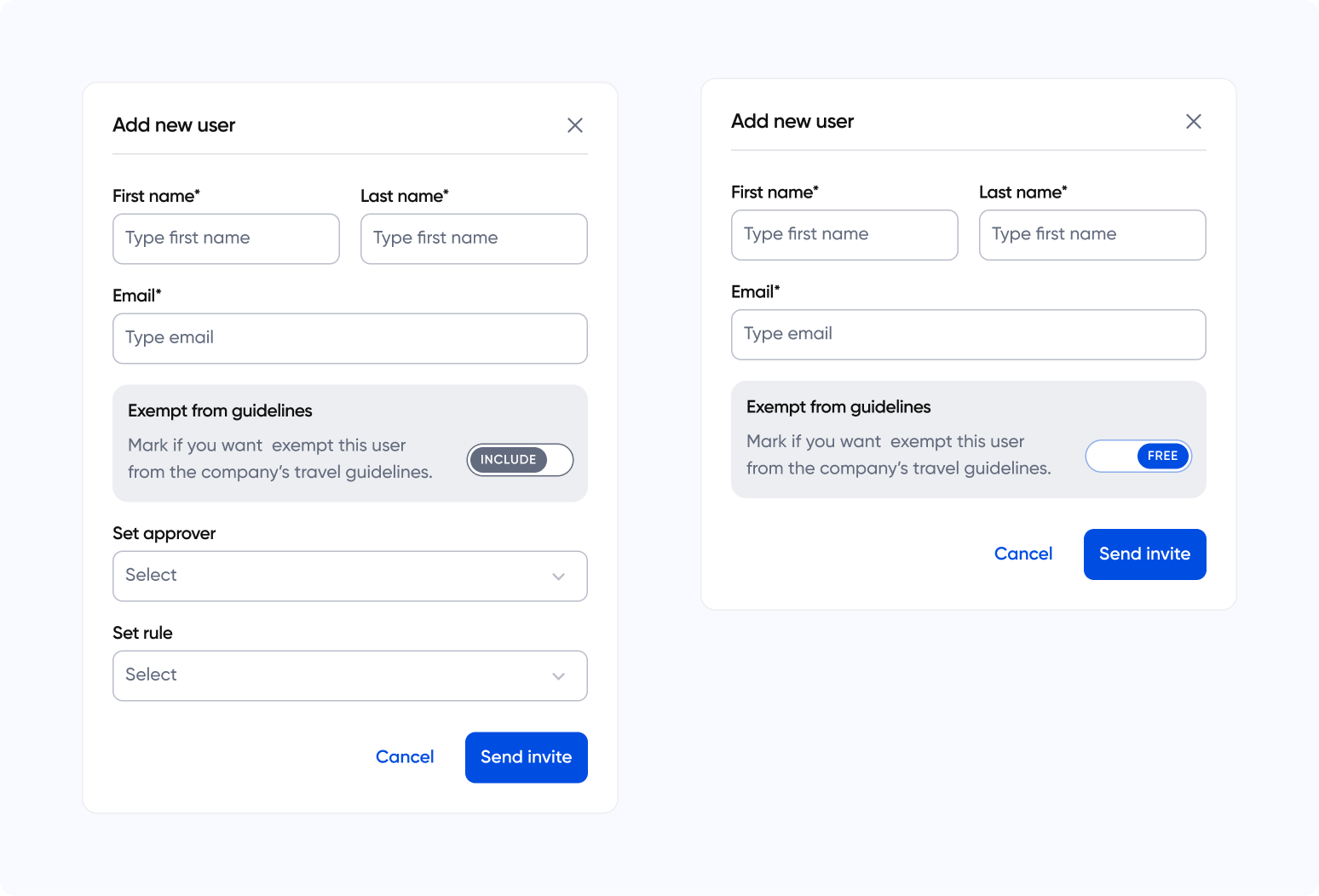
Team Management (Add New User)
- Rule Flexibility: New option to exempt specific users from company guidelines ("Exempt from guidelines"), allowing for greater customization for C-level roles or exceptions.
05.
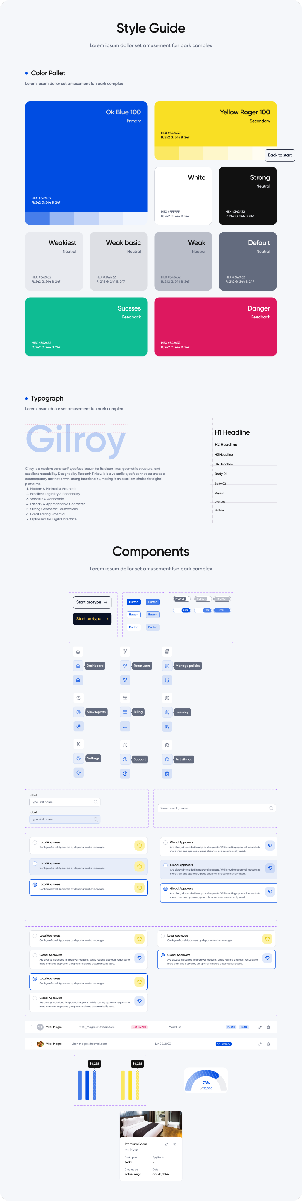
Design System & Style Guide
To ensure scalability and consistency, a robust visual guide was developed:
06.
Conclusion
The OK Roger redesign demonstrates how applying solid design principles can transform a dense administrative tool into a high-usability platform. The focus on visual clarity and optimization of critical flows resulted in an experience that delivers the "total control" value promised by the product.
👋👋